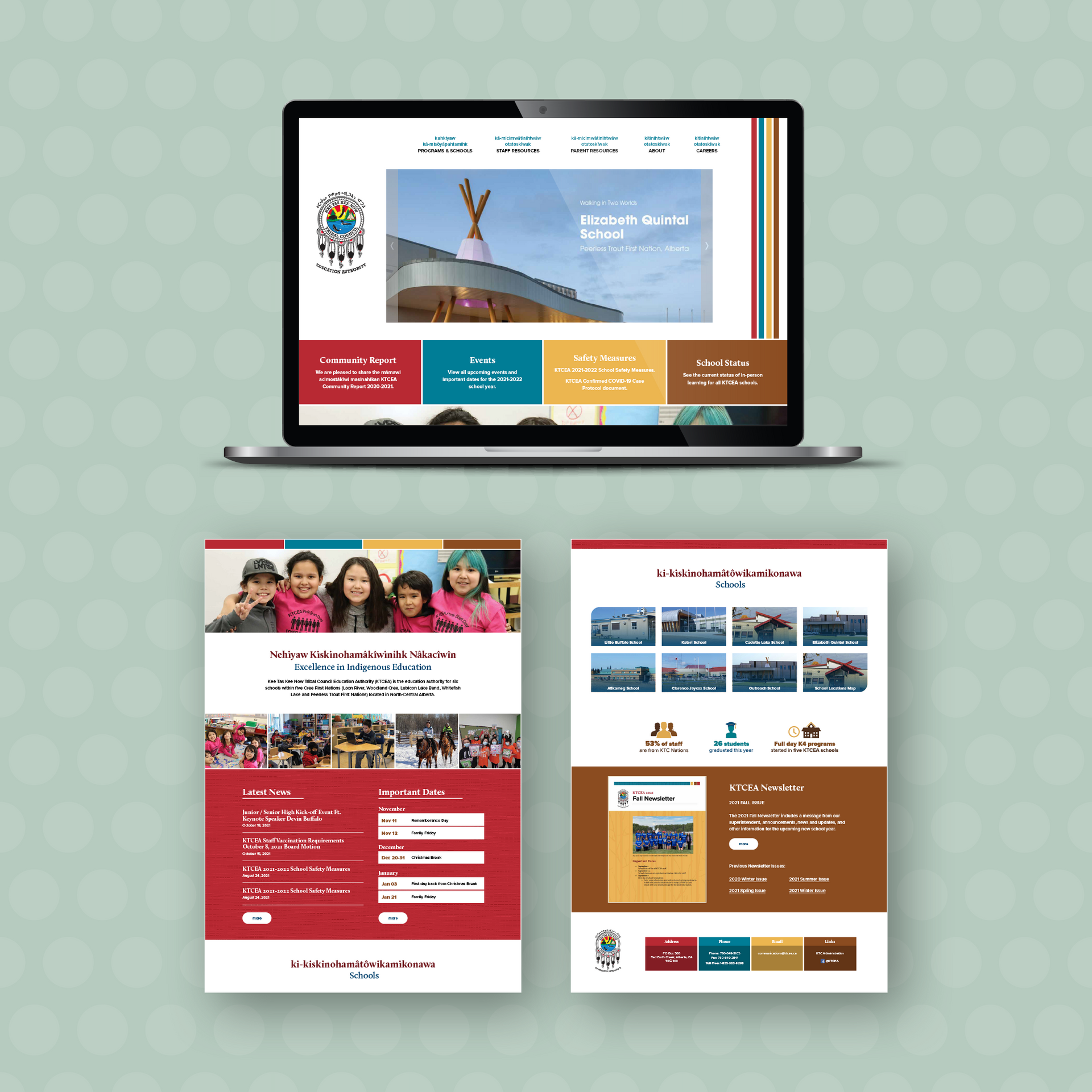
Kee Tas Kee Now Tribal Council Education Authority (KTCEA)

KTCEA is responsible for the administration of K-12 education in five Cree First Nations that form the Kee Tas Kee Now Tribal Council (KTC) in north-central Alberta. Their schools provide a quality education that ensures nîhiyâwîwin ways thrive through Cree language and land-based learning while serving 1,100 students across a geographic territory of 8,200 square kilometres.
Project:
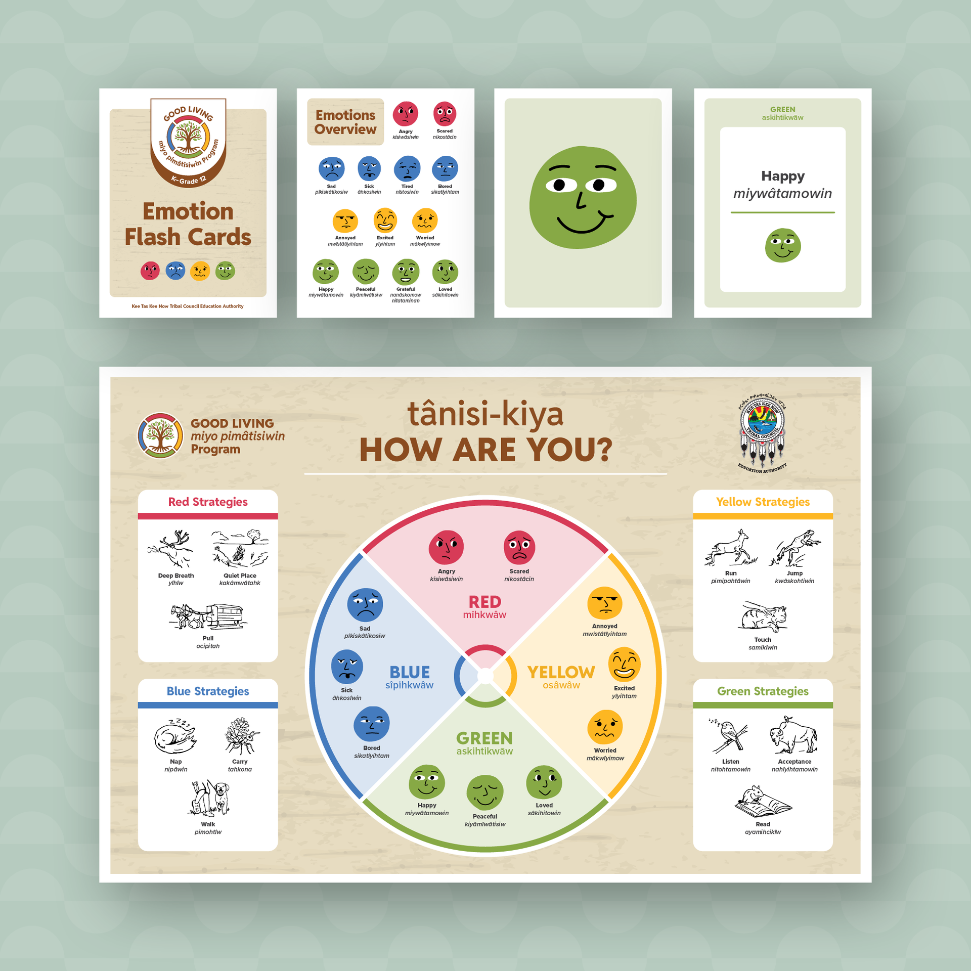
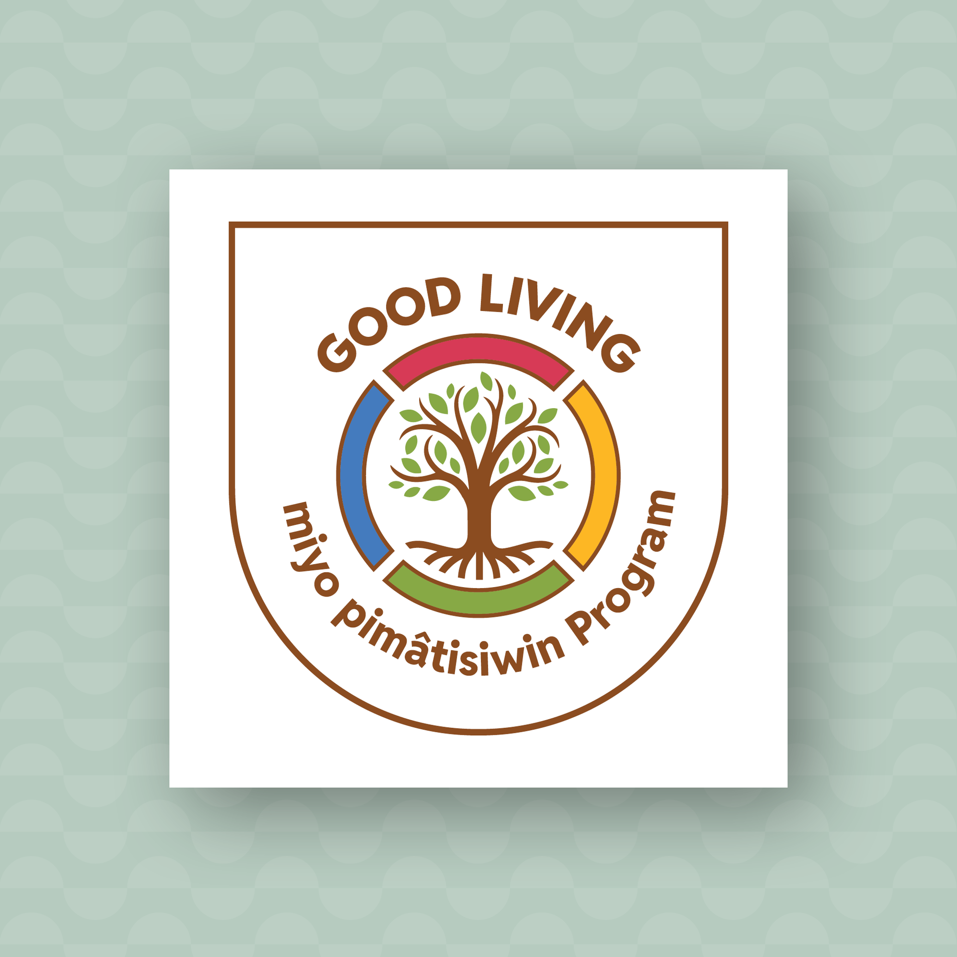
Good Living Program
Details:
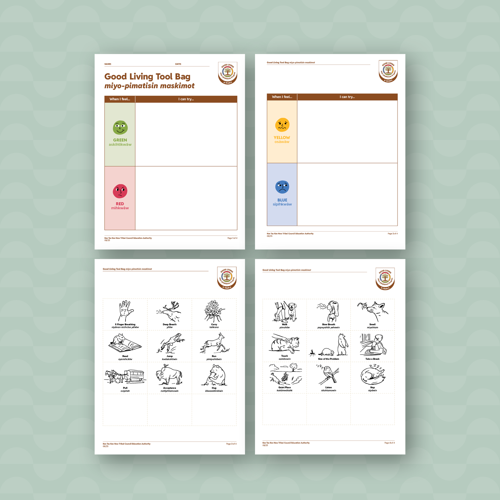
The Good Living Program was created by KTCEA to help Cree students with social-emotional skills. Centered around the four Zones (colours) of Regulation from mainstream education, Diva’s role was to incorporate Cree words and create a look that ties into the Indigenous culture. We did this by creating graphics with organic lines and incorporating illustrations with nature and animals wherever possible. It was important to Inclusive Education that the colours still be bright but also appeal to the wide rage of students in Kindergarten through grade 12, so an easy to read sans-serif font was chosen and paired with browns and tans to offset the playfulness of the four bright zone colours.The logo includes the four colours of regulation, also mimicking the traditional quadrants of the medicine wheel, rotated 45 degrees so that the Tree of Life is growing out of the Green (regulated) zone. An insignia version was also created for the worksheets with a grade level indicator for easy identification.
A large classroom poster was created as the centerpiece for all the material showcasing the emotions as illustrated emojis and custom strategy illustrations. Flashcards and worksheets followed to guide students and teachers in activities to reinforce the English and Cree social-emotional vocabulary and skills.
Deliverables:
Logo, branding, poster, worksheets, flashcards, Illustrations
Project:
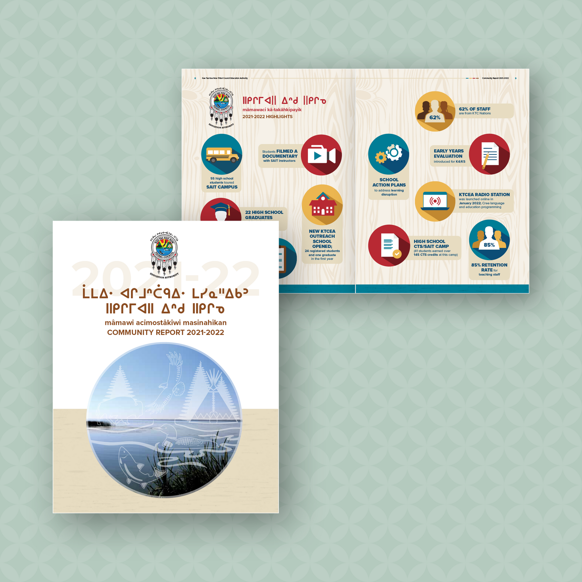
2024 Community Report
Details:
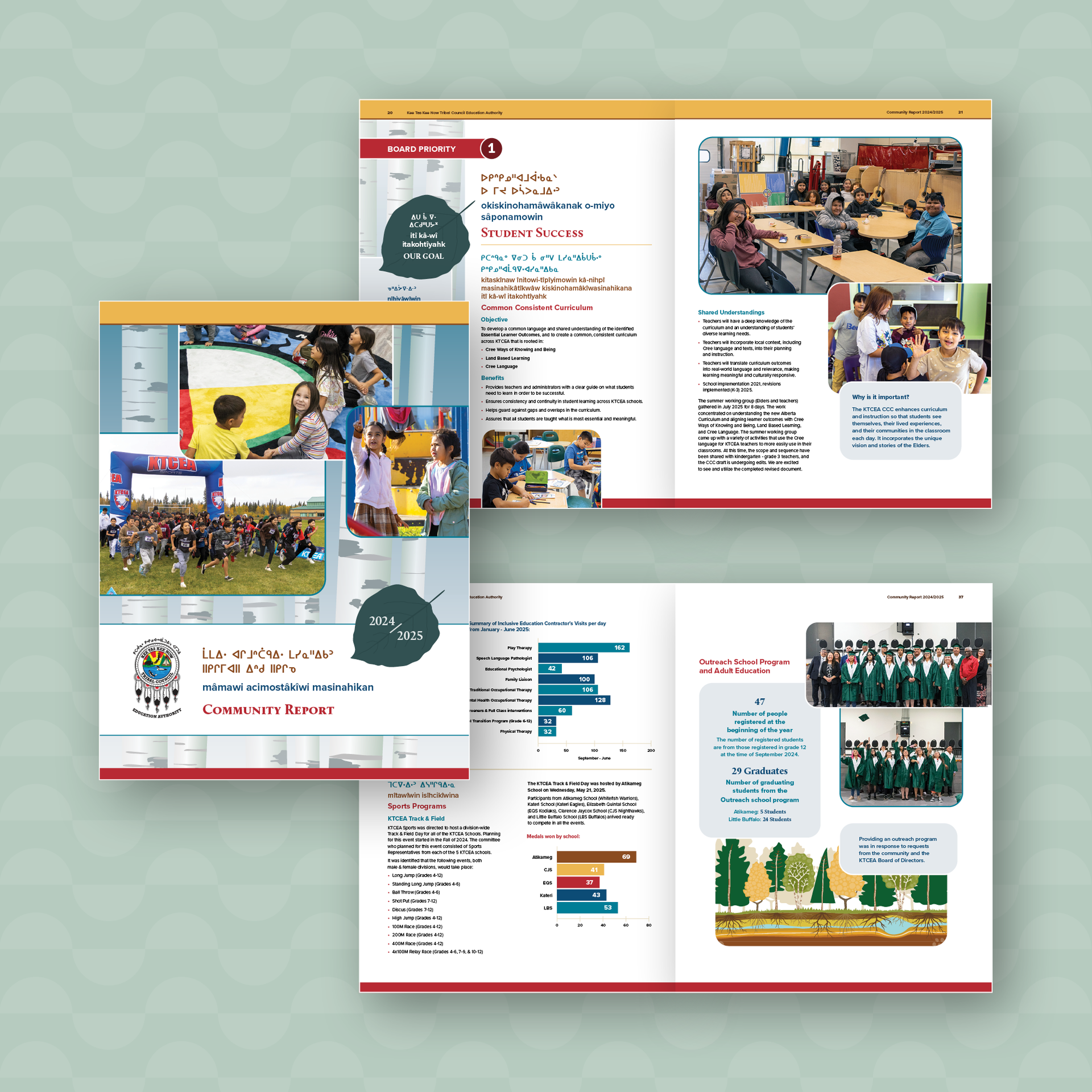
The community report is put together every year. Each year it follows a different visual theme that slightly deviates from their typical report style, but maintains adherence to the existing brand rules and guidelines.The 2024 concept incorporates the aspen tree which signifies growth and a connection to nature. The trees are graphically illustrated on the cover and on various pages throughout the document. An individual aspen leaf is also used as a visual element.
Images are featured with rounded corners and are overlapped giving a warm and inviting feel and pull quotes are also given a similar treatment.
The brand colours are highlighted throughout with a dark teal being introduced in the aspen leaf.
Deliverables:
Printed booklet designAdditional designed projects:
Resource guides, brand identity, annual reports, trade-show displays, newsletters, website design, conference branding and materials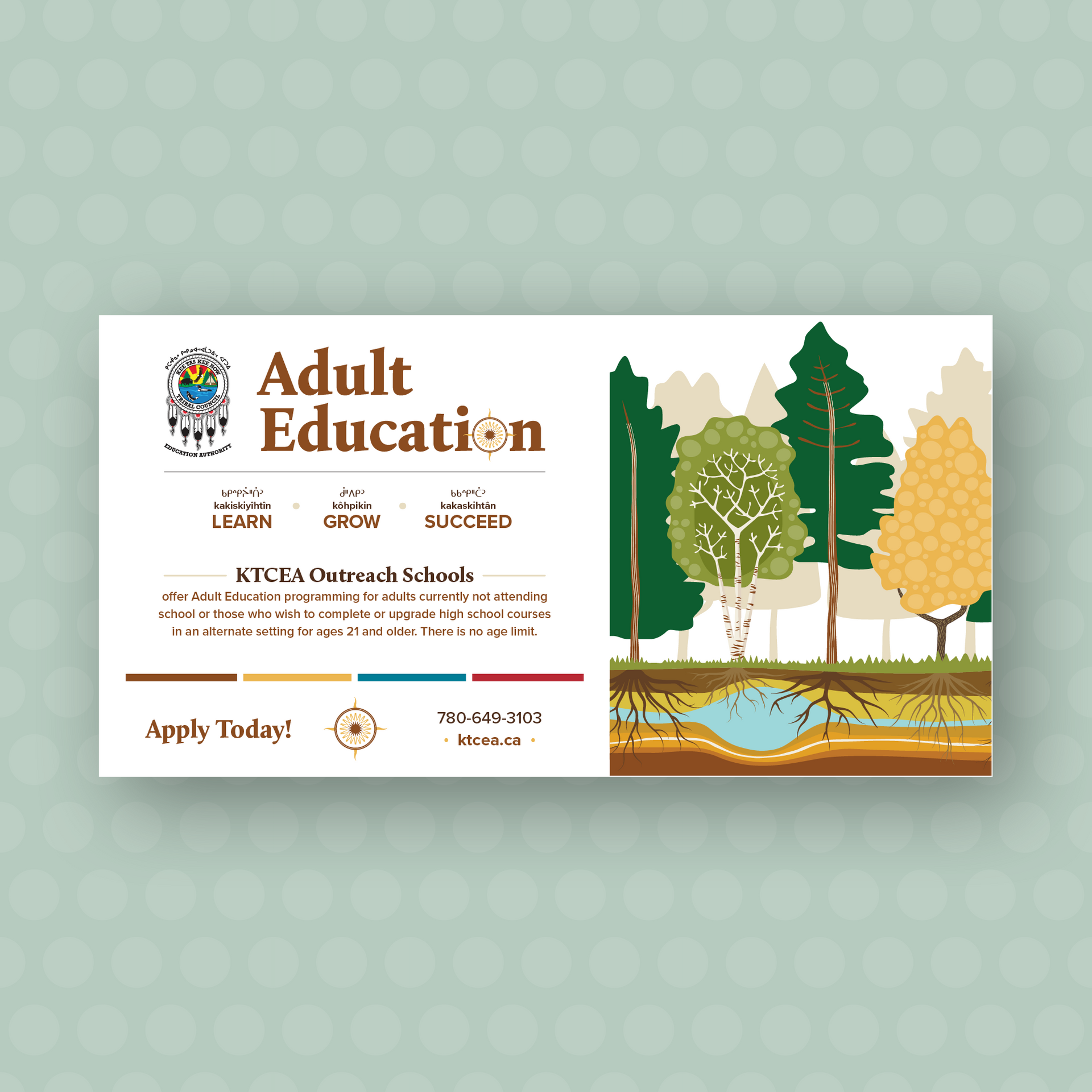
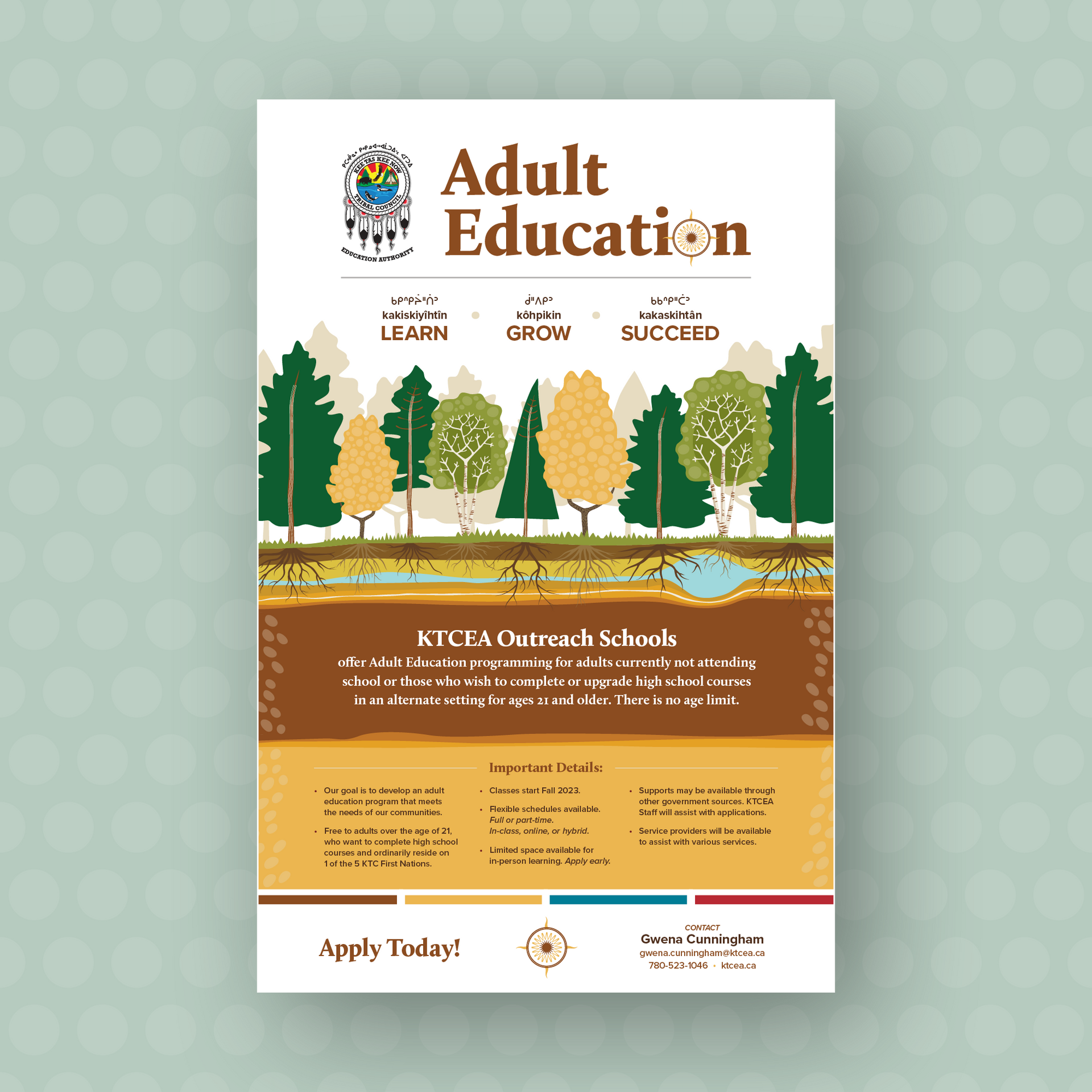
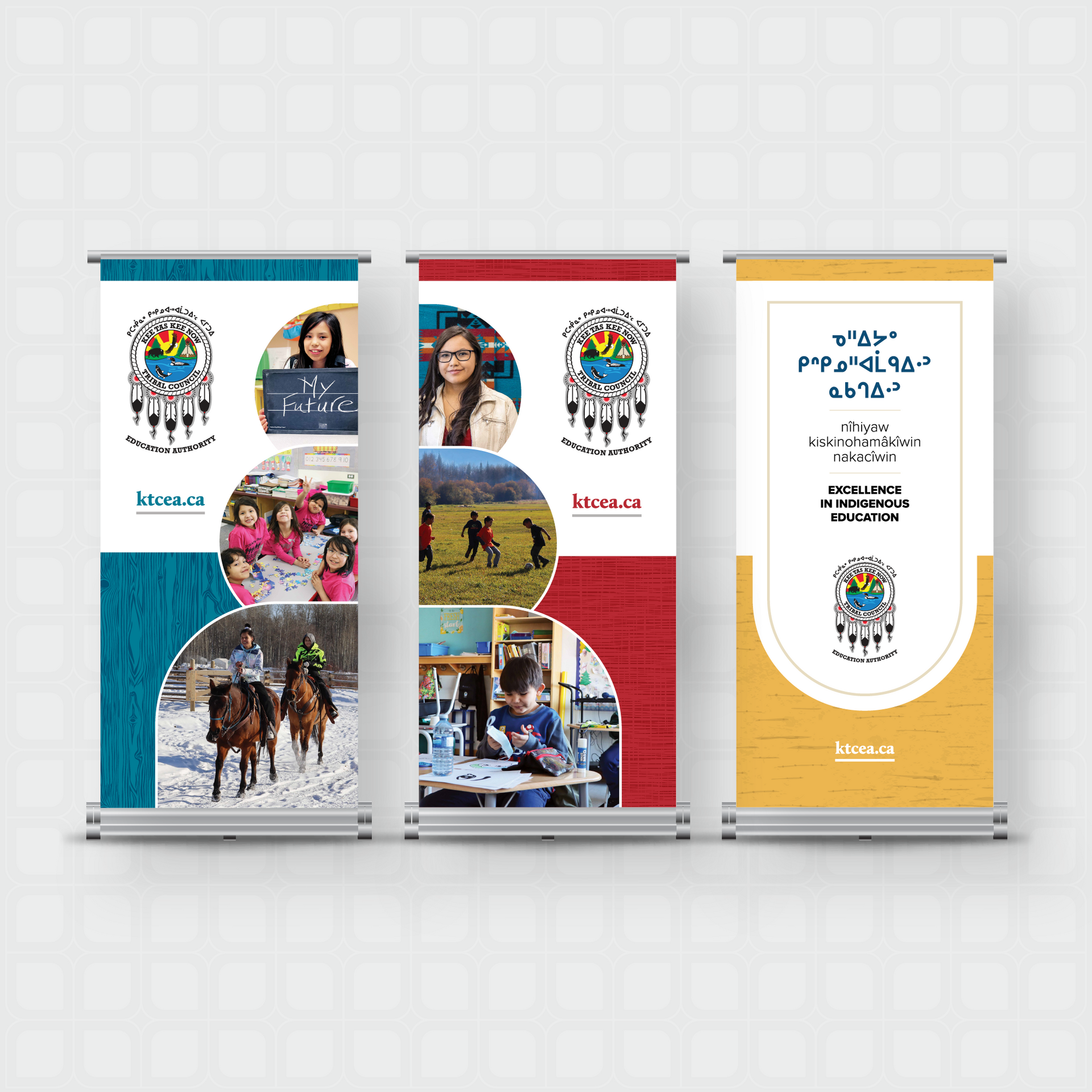
Project:
Adult Education Campaign
Details:
KTCEA is responsible for the administration of K-12 education in five Cree First Nations that form the Kee Tas Kee Now Tribal Council (KTC) in north-central Alberta. Their schools provide a quality education that ensures nîhiyâwîwin ways thrive through Cree language and land-based learning while serving 1,100 students across a geographic territory of 8,200 square kilometres.Deliverables:
Posters, brochure, social media and website graphicsAdditional designed projects:
Resource guides, brand identity, annual reports, trade-show displays, newsletters, website design, conference branding and materials.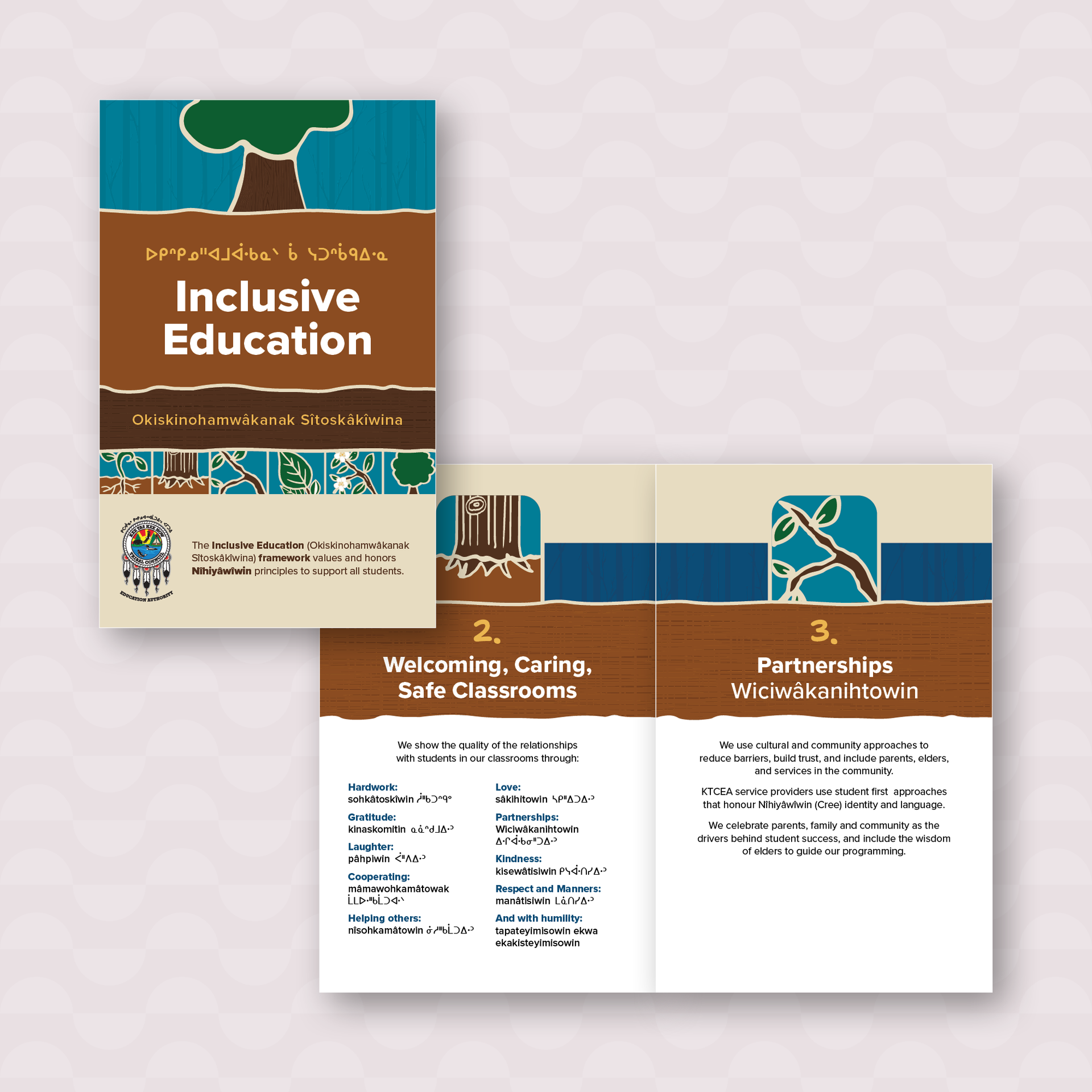
Project:
Inclusive Education Framework Handout
Details:
KTCEA wanted visuals to demonstrate a theme of “cementing the growth of our children” alongside the six value points of the framework. Diva accomplished this with a six-piece illustration to tell the story of growth: planting and tending to a seed as it grows into a tree. The idea is that the seed is a student and it needs a solid “ground” and help along the way to mature.Deliverables:
Print and digital bookletAdditional designed projects:
Resource booklets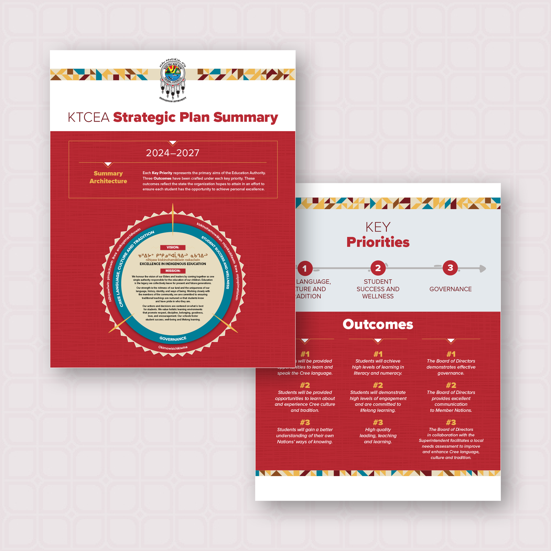
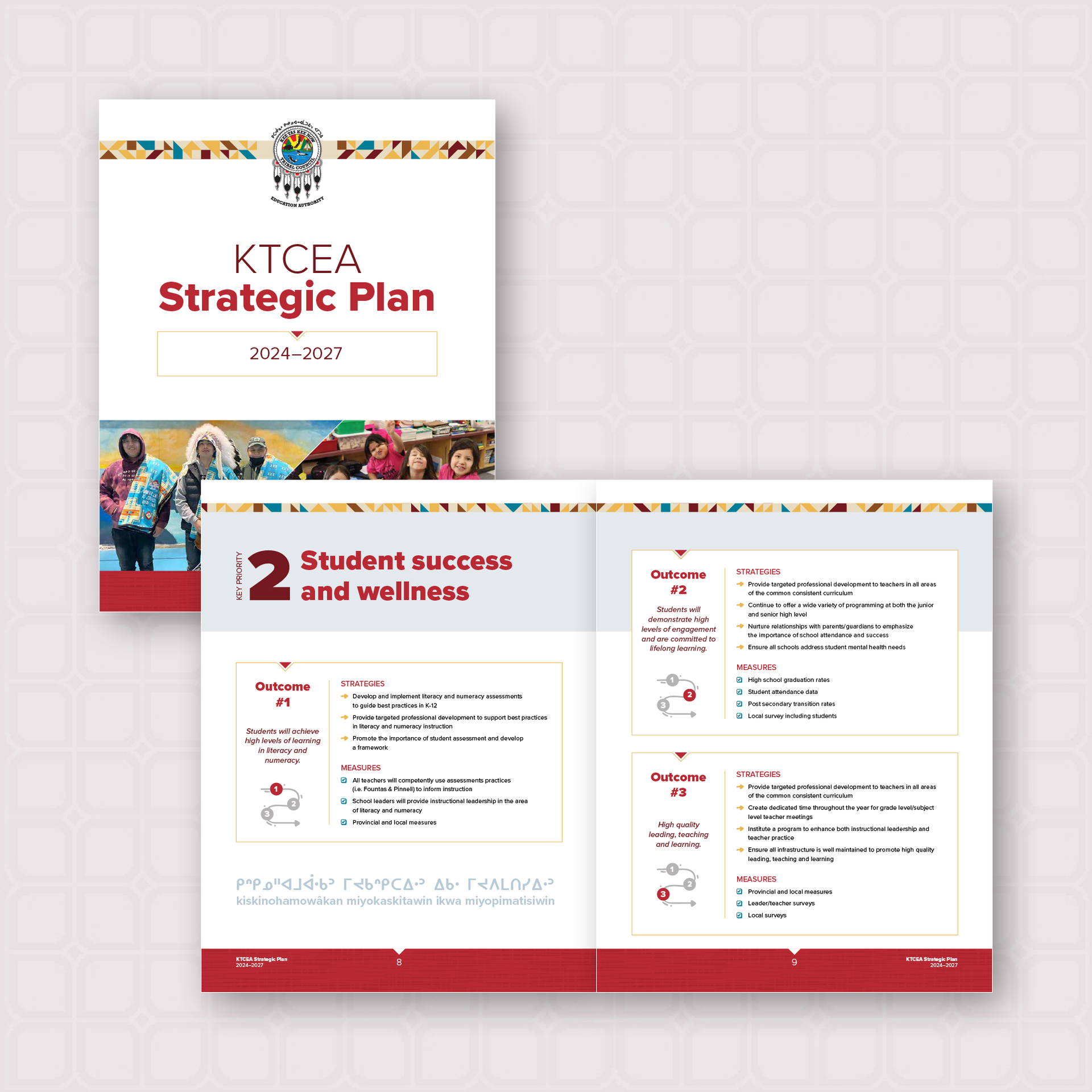
Project:
Strategic Plan
Details:
KTCEA required a new design to encompas their strategic plan and summary document. Graphics needed to be simple enough to incorporate on future materials regarding the strategic plan, yet engaging enough to show the momentum the plan has moving forward. An energetic pattern made from geometric shapes in the KTCEA brand colours is featured on each page to symbolize this structured momentum. Contrasting bold text and thin lines with a triangle from the pattern continues this energy throughout the document, emphasizing the Key Priorities and Outcomes. Smaller illustrative symbols also add energy and interest to the pages.Deliverables:
Print and digital report, summary sheetAdditional Projects