
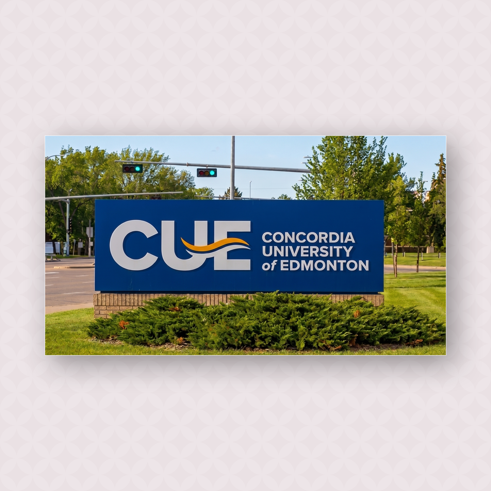
To help expand the CUE brand and to further show of the institution’s growth and vibrancy, a new wordmark and icon were developed for use as a secondary mark to represent the University.
Using the acronym CUE to describe themselves, a mark was developed inspired by the Edmonton’s river valley which they overlook. A wave was incorporated into the letters using the new main brand colours.
The icon is the version used for various web and social media platforms, encased in a circle to make the wordmark a focal point and to give it strength and visibilty on social media.