City of Fort Saskatchewan (CoFS)

The City of Fort Saskatchewan manages recreation, culture and historic amenities - including a performing arts theatre and a fitness centre within the Dow Centennial Centre and the historic 1875-1885 NWMP Fort Representation in the heart of downtown.
Project:
Aquatics Campaign
Details:
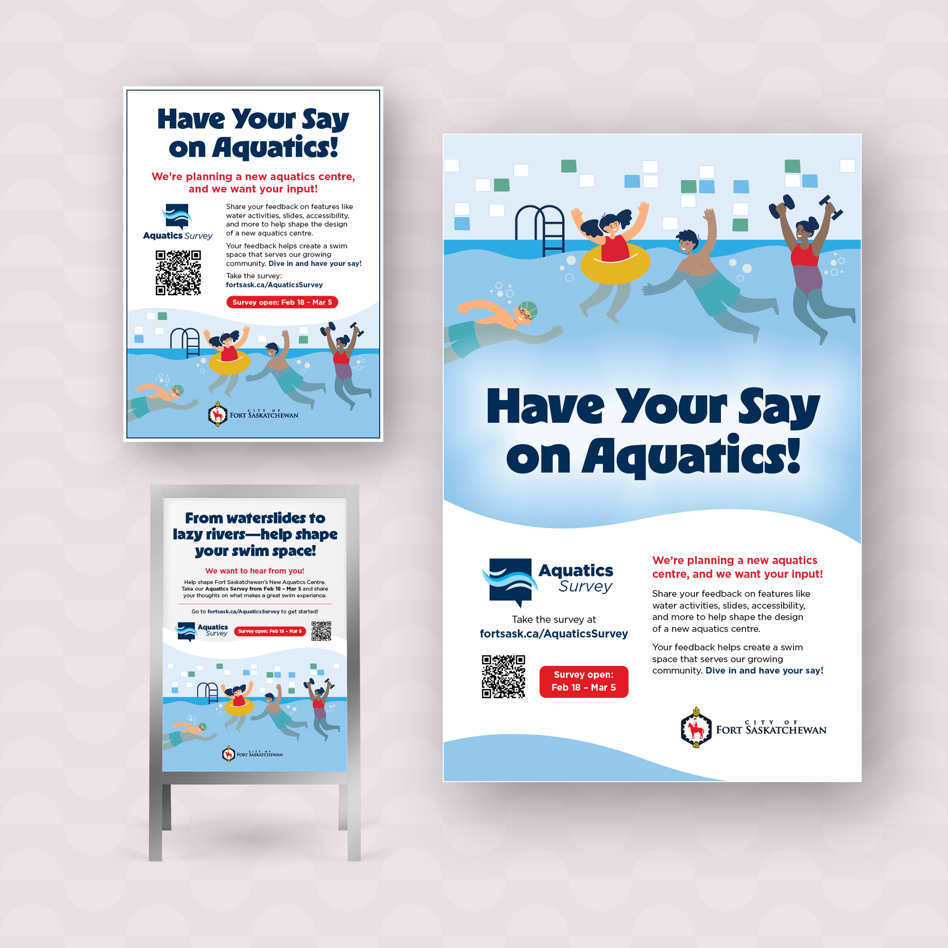
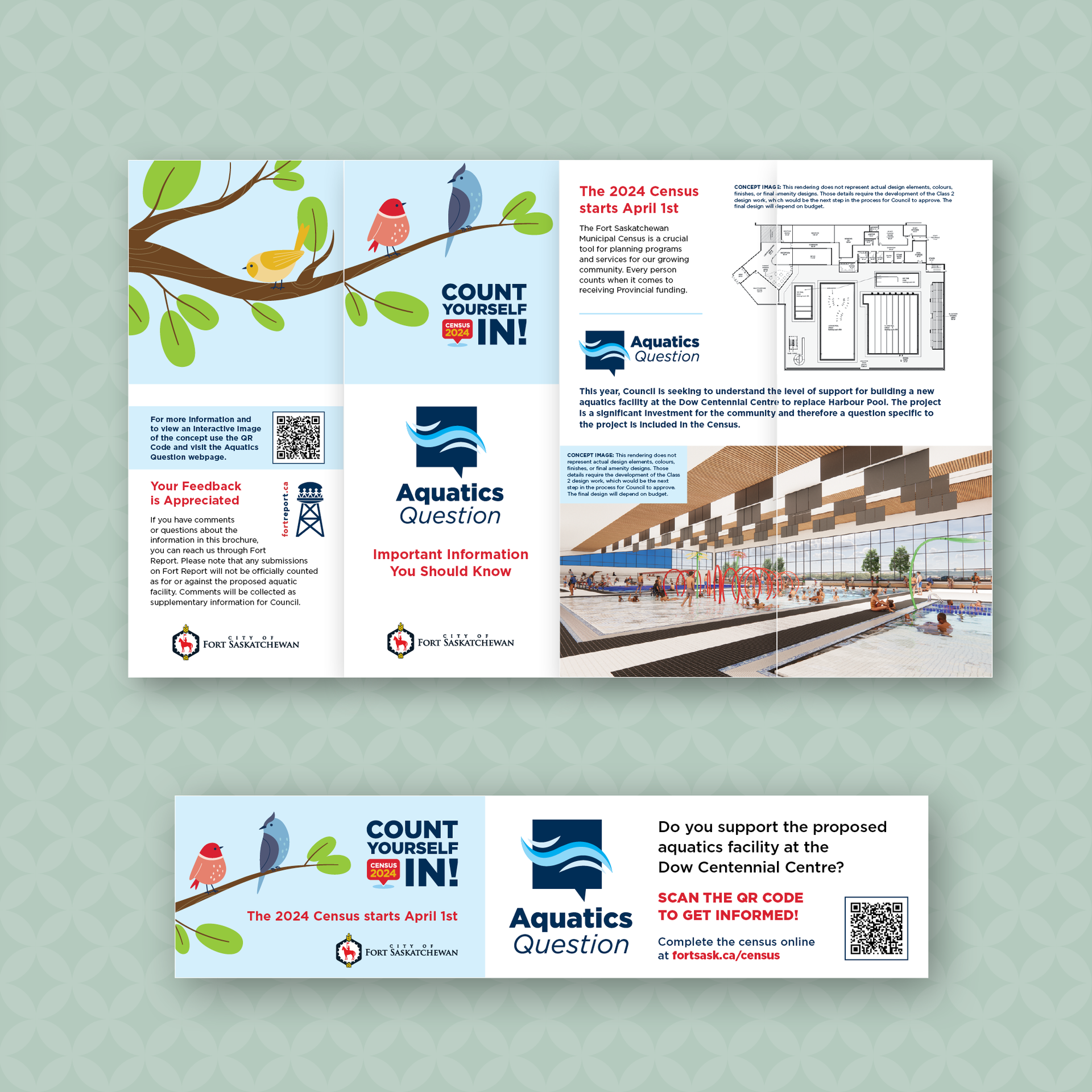
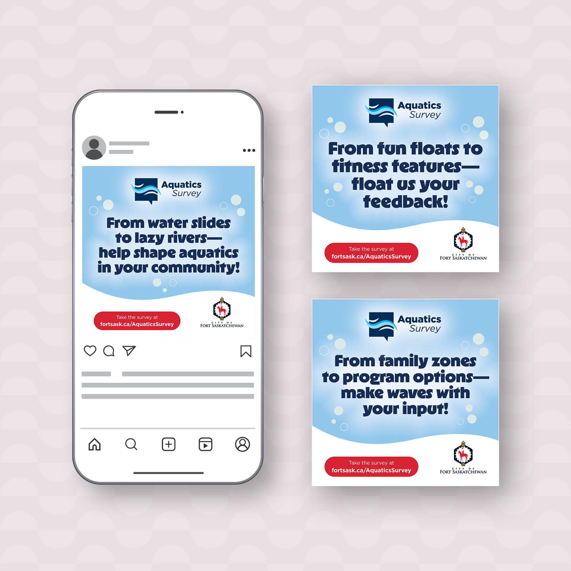
The Aquatics team was about to launch a community survey to gather resident feedback on amenities for the new pool. They came to design marketing materials to promote the survey, along with a few additional items like a Word document template for the report and some website images for the survey platform.Having been extremely please with the design we created for their 2024 Census campaign, they again wanted to use the “Aquatics Question” logo that we designed, and hoped for the creative to have the same feel as that campaign.
We designed this campaign based on an illustration that had a whimsical feel similar to what was created for the Census campaign. It depicted an indoor pool with a child and three adults enjoying the facility and spoke to the Aquatics question survey to “create a swim space that fits our community”.
The colour scheme is from the Aquatics Question logo and we added a green, red and yellow to add vibrancy (and to tie in the Fort Saskatchewan logo). The wave graphics that frame the copy are the same as in the logo.
The headline font was selected because of the wavy nature of the letters and its fun, engaging feel.
The graphics carried through into all assets produced.
Deliverables:
PRINT - posters, postcard, a-frame signage, newspaper ad. DIGITAL - social media posts, DCC billboard, mobile billboards, website landing page banner.
Project:
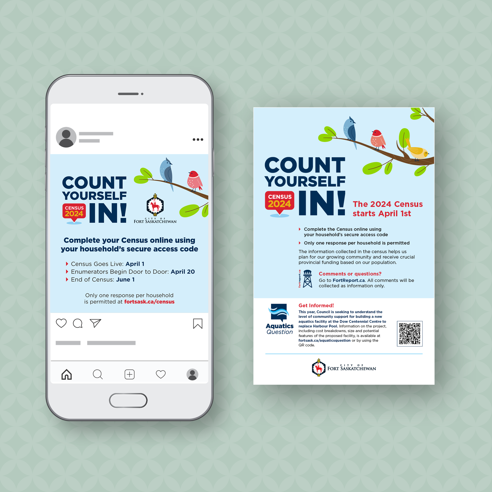
2024 Census Campaign
Details:
The 2024 Census Campaign featured a question regarding the community’s thoughts on building a new Aquatics Centre. Our task was to tie this information into the campaign design.Keeping in line with the CoFS brand, we designed a wordmark for the title of the campaign - Count Yourself In! - along with a separate logotype for the “Aquatics Question.” We tied the layout design together with a whimsical, spring-themed illustration and added a secondary colour palette to suit the season.
Deliverables:
Social media ads (FB, IG), transit advertising, newspaper ads, mobile billboards, cinema ads, posters, DCC signage, brochures, utility inserts, education station display, web graphics.Additional designed projects:
Bike Skills Park campaign, transit campaign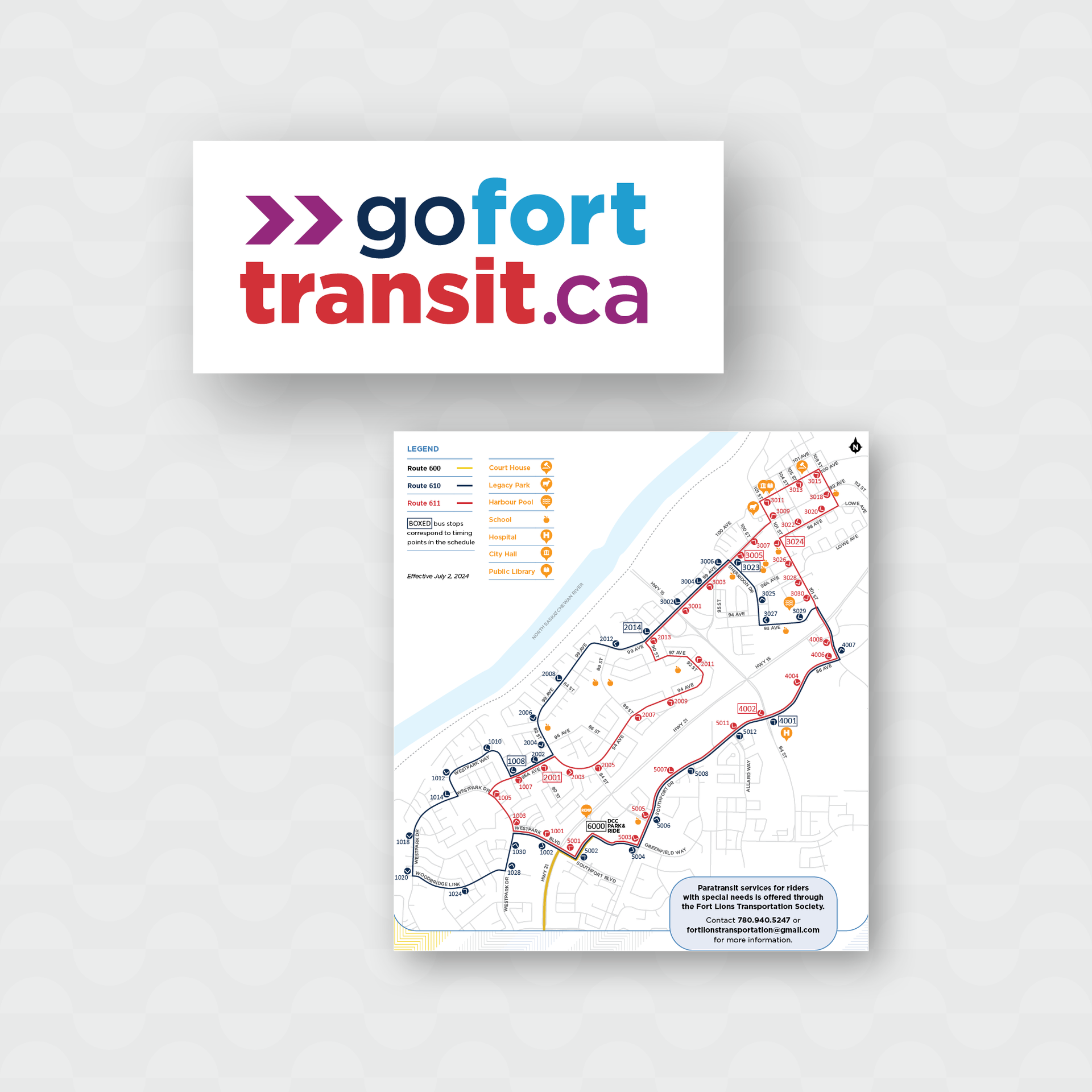
Project:
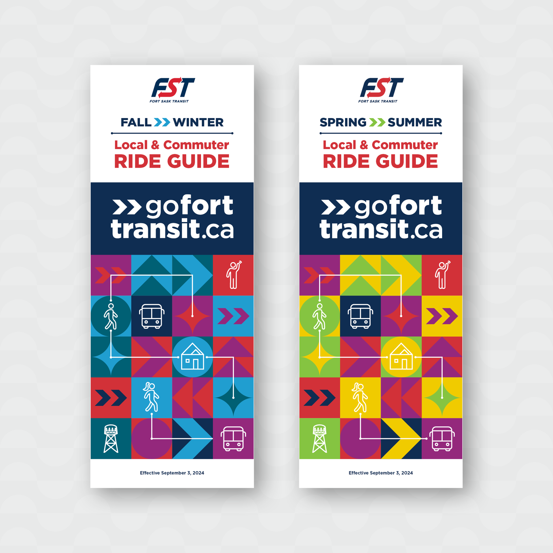
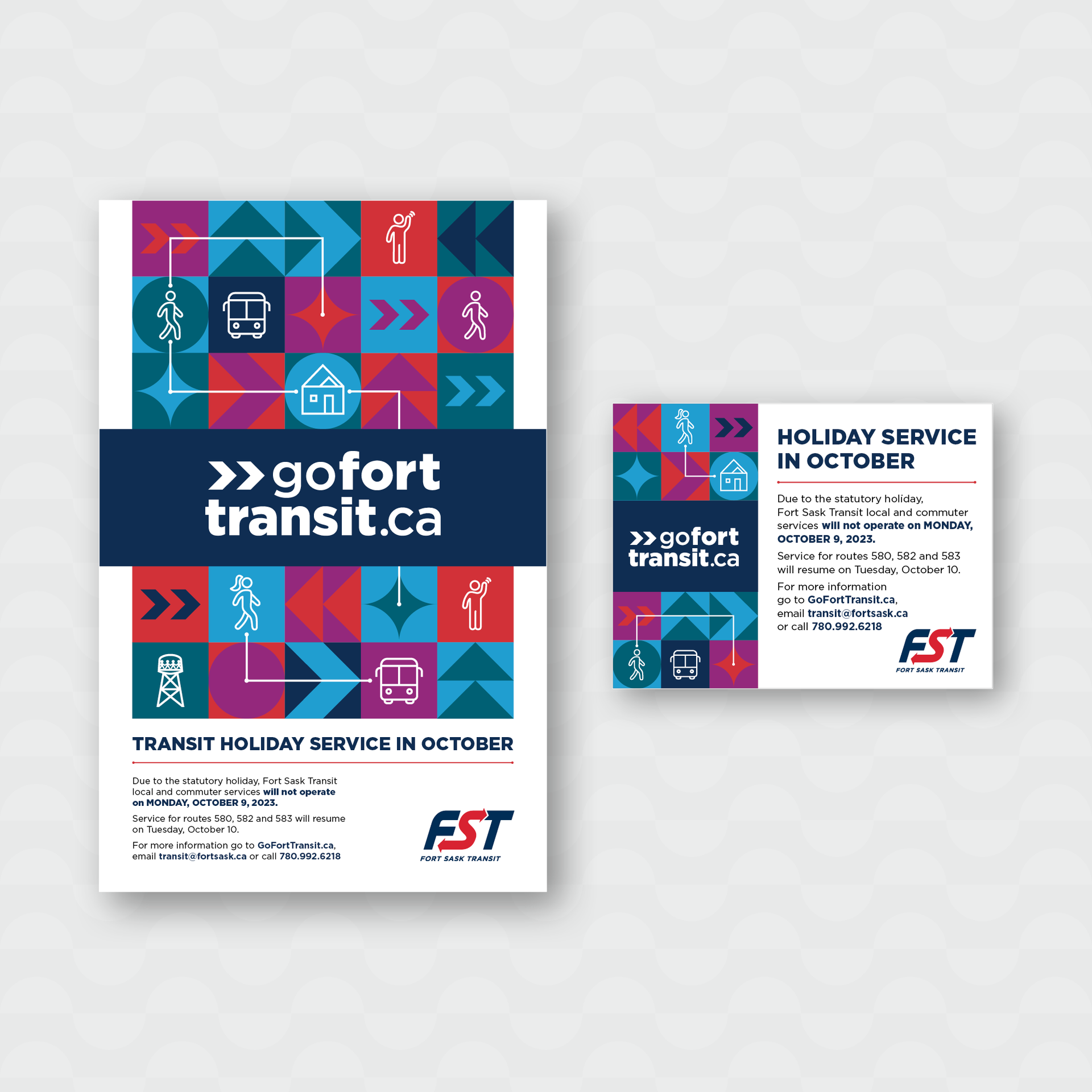
2024/25 GoFortTransit Campaign
Details:
Fort Sask Transit (FST) is a pivotal service in the community, providing safe and dependable transportation within the city and an enhanced commuter service to Sherwood Park.FST was looking to develop and launch a new marketing/advertising campaign to refresh their image and strengthen their connections with current and prospective riders. With newly designed buses, updated routes and schedules, and a revised commuter service route taking passengers out of Fort Saskatchewan, FST needed to transition from the old branding to one that engages their audience with an innovative and memorable design.
Diva first developed a wordmark that has dual purpose as a headline and call to action. We also created a pattern of engaging arrows and geometric shapes with connecting lines in vibrant colours that will attract the audience and hint at the idea of transit movement and connection. Icon illustrations were added to demonstrate the wide variety of patrons of the transit system. To differentiate between the seasonal bus route changes we created two distinctly coloured patterns to accompany the headlines. Because of a limited budget and tight timelines, we created templates and brochure covers for the CoFS to edit and use as needed. We also redesigned the map to make it more legible and printer friendly.